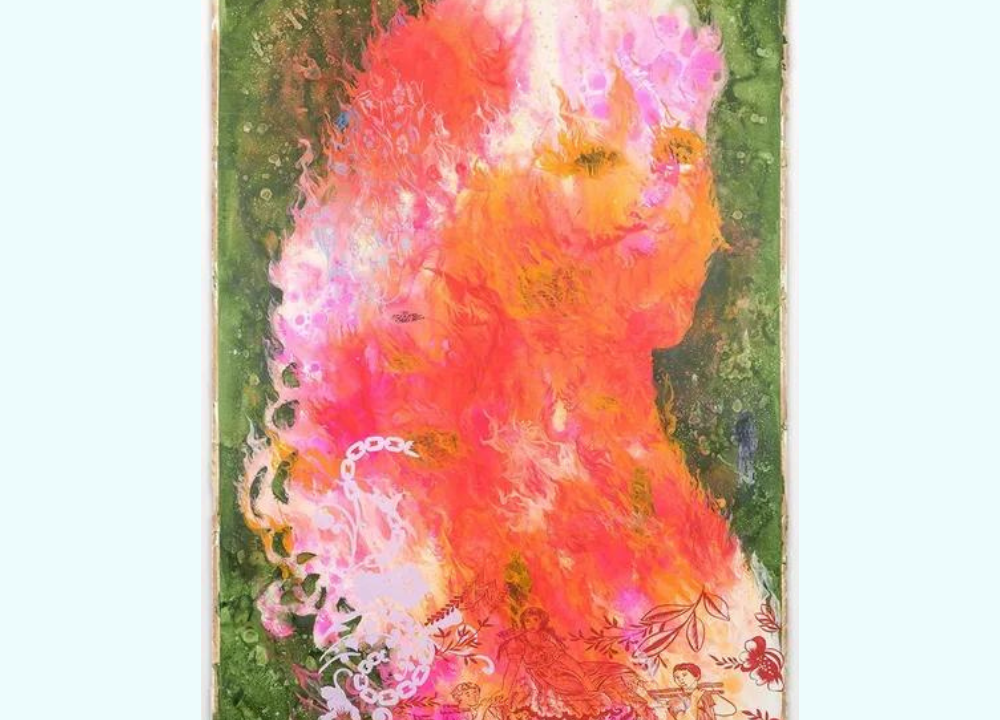
Ink drawing is one of the most expressive forms of visual art. By manipulating line weight, artists can create depth, emotion, and rhythm in their work. Line variation transforms simple marks into powerful storytelling tools, making ink a timeless medium for illustration, design, and fine art.
What Is Line Weight in Ink Drawing?
Line weight refers to the thickness or thinness of a drawn line. It is a fundamental concept in ink drawing because it influences how viewers perceive form, space, and emphasis.
Defining aspects of line weight:
- Thin Lines – Suggest delicacy, detail, or distant elements.
- Thick Lines – Convey strength, boldness, or foreground presence.
- Consistent Weight – Creates uniformity and clarity.
- Variable Weight – Adds dynamism and visual interest.
- Controlled Pressure – Adjusts line thickness with hand movement.
Line weight is more than a technical choice—it’s a language of expression. By varying thickness, artists guide the viewer’s eye, emphasize focal points, and create mood. Understanding line weight is the first step toward mastering expressive ink drawing.
Why Line Weight Matters in Artistic Expression
Line weight is not just a stylistic detail; it shapes the emotional impact of an artwork. A single stroke can suggest fragility or power depending on its thickness.
Ways line weight influences expression:
- Mood Creation – Heavy lines feel dramatic, light lines feel calm.
- Depth Perception – Thick lines bring objects forward, thin lines push them back.
- Characterization – Defines personality in portraits or figures.
- Movement – Varied lines suggest energy and flow.
- Focus – Guides attention to important areas.
Artists use line weight to communicate beyond literal representation. It becomes a tool for storytelling, allowing ink drawings to resonate emotionally with viewers. Mastery of line variation ensures that every stroke carries meaning.
Tools for Controlling Line Weight in Ink
The choice of tools directly affects how line weight is achieved. Different pens, brushes, and nibs produce distinct qualities.
Common tools for line variation:
- Technical Pens – Consistent, precise lines.
- Dip Pens – Flexible nibs for expressive variation.
- Brush Pens – Smooth transitions from thin to thick.
- Markers – Bold, uniform strokes.
- Traditional Brushes – Organic, fluid line control.
Each tool offers unique possibilities. Dip pens allow dramatic shifts in thickness, while brush pens provide fluidity. Selecting the right instrument depends on the desired effect. Experimenting with tools helps artists discover personal styles and refine their expressive vocabulary.
Techniques for Creating Expressive Lines
Beyond tools, technique determines how line weight is applied. Artists manipulate pressure, speed, and angle to achieve expressive results.
Effective techniques include:
- Pressure Control – Press harder for thicker lines, lighter for thin.
- Speed Variation – Faster strokes appear lighter, slower strokes heavier.
- Angle Adjustment – Tilt nibs or brushes for different effects.
- Layering – Build thickness through repeated strokes.
- Gesture Drawing – Capture movement with varied line flow.
These techniques transform simple marks into expressive gestures. Practicing them develops muscle memory and confidence. Over time, artists learn to balance control with spontaneity, producing lines that feel alive and intentional.
Line Weight in Portraits and Figures
In portraiture and figure drawing, line weight defines anatomy, emotion, and character. Subtle variations can suggest softness or tension.
Applications in portraiture:
- Facial Features – Thin lines for delicate details.
- Hair and Texture – Varied strokes for realism.
- Contours – Bold outlines for structure.
- Shadows – Layered lines for depth.
- Emotion – Expressive strokes to convey mood.
Line weight allows artists to capture personality beyond likeness. A heavy contour might suggest strength, while light strokes imply vulnerability. In figure drawing, varied lines emphasize movement and anatomy, making ink portraits dynamic and expressive.
Line Weight in Landscapes and Architecture
Line variation is equally important in landscapes and architectural sketches. It helps distinguish foreground from background and adds structural clarity.
Uses in landscapes and architecture:
- Foreground Elements – Thick lines for trees, rocks, or buildings.
- Background Details – Thin lines for distant hills or sky.
- Structural Emphasis – Bold strokes for architectural outlines.
- Texture Rendering – Varied lines for stone, wood, or foliage.
- Atmosphere – Light strokes for mist or distant perspective.
By adjusting line weight, artists create depth and realism. Architecture benefits from bold outlines, while landscapes gain atmosphere through delicate strokes. This balance ensures compositions feel both grounded and expressive.
Combining Line Weight with Shading Techniques
Line weight works best when combined with shading. Cross‑hatching, stippling, and contour shading enhance depth and texture.
Shading methods with line weight:
- Cross‑Hatching – Overlapping lines for tonal variation.
- Stippling – Dots combined with varied outlines.
- Contour Shading – Lines follow form for realism.
- Parallel Lines – Consistent strokes for smooth gradients.
- Mixed Techniques – Combining methods for complexity.
Integrating shading with line weight creates dimensionality. It allows ink drawings to move beyond outlines into fully realized compositions. Artists can control light, shadow, and atmosphere while maintaining expressive line quality.
Common Mistakes with Line Weight and How to Avoid Them
Beginners often struggle with consistency or overuse of heavy lines. Recognizing mistakes helps refine technique.
Frequent errors include:
- Uniform Lines – Lack of variation makes drawings flat.
- Excessive Thickness – Overpowering strokes reduce subtlety.
- Random Variation – Inconsistent changes confuse viewers.
- Neglecting Background – Ignoring depth weakens composition.
- Poor Tool Choice – Using pens unsuited for desired effect.
Avoiding these mistakes requires practice and observation. Artists should study professional ink drawings, experiment with tools, and analyze their own work. Over time, line weight becomes intentional rather than accidental, elevating artistic expression.
Developing Your Personal Style with Line Weight
Line weight is not just a technical skill—it’s a pathway to personal style. Each artist develops unique rhythms and preferences.
Ways to build personal style:
- Experimentation – Try different tools and techniques.
- Observation – Study how masters use line variation.
- Consistency – Develop habits that define your work.
- Risk‑Taking – Push boundaries with bold choices.
- Reflection – Analyze what feels authentic.
Personal style emerges through exploration. By embracing line weight as expressive language, artists create work that feels distinctive and memorable. Over time, their drawings reflect not only technical skill but also individuality and emotion.