Art composition is the invisible architecture that gives paintings their strength, clarity, and emotional resonance. Without thoughtful composition, even the most skillful brushwork can feel scattered or incomplete. By applying timeless rules of arrangement, artists can transform ordinary scenes into powerful visual experiences that guide the viewer’s eye, evoke emotions, and communicate meaning.
Balance in Composition
Balance is one of the most fundamental principles in art composition. It refers to the distribution of visual weight within a painting, ensuring that no part feels too heavy or too light compared to the rest. Artists achieve balance by carefully arranging elements such as shapes, colors, and textures so that the viewer’s eye moves comfortably across the canvas. A balanced painting feels harmonious and complete, while imbalance can create tension or unease.
- Symmetrical balance – Both sides of the canvas mirror each other, creating stability.
- Asymmetrical balance – Different elements are arranged to achieve equilibrium without being identical.
- Radial balance – Elements radiate outward from a central point, often used in mandalas or circular designs.
- Color balance – Warm and cool tones are distributed evenly to avoid dominance of one palette.
- Texture balance – Smooth and rough surfaces are combined to create visual interest without overwhelming the viewer.
By mastering balance, artists guide the viewer’s gaze naturally, making the artwork feel both intentional and pleasing. This principle is essential for creating paintings that resonate emotionally and visually with audiences.
Rule of Thirds
The rule of thirds is a powerful guideline that helps artists create dynamic and engaging compositions. By dividing the canvas into nine equal sections using two vertical and two horizontal lines, artists can position focal points at the intersections. This technique prevents the subject from being centered, which often feels static, and instead introduces movement and energy.
- Grid division – The canvas is split into thirds both vertically and horizontally.
- Focal points – Important subjects are placed at intersections for maximum impact.
- Dynamic tension – Off-center placement creates visual interest and balance.
- Landscape use – Horizons are aligned with upper or lower thirds to avoid splitting the canvas in half.
- Portrait use – Eyes or facial features are positioned along the grid for natural emphasis.
This rule is widely used in painting, photography, and design because it enhances storytelling and directs attention effectively. By applying the rule of thirds, artists ensure their compositions feel alive and compelling.
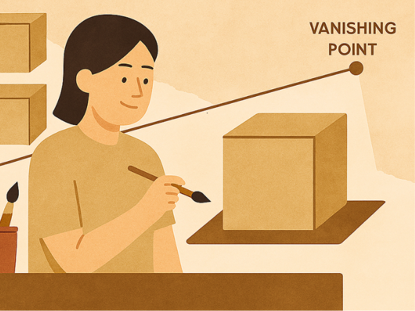
Leading Lines
Leading lines are visual pathways that guide the viewer’s eye through a painting. They can be literal, such as roads or rivers, or implied, such as the direction of a gaze or the alignment of objects. These lines create movement, depth, and focus, making the composition more engaging.
- Diagonal lines – Add energy and dynamism to the scene.
- Curved lines – Suggest flow and softness, often used in landscapes.
- Converging lines – Lead toward a vanishing point, enhancing perspective.
- Implied lines – Created by gestures, gazes, or object placement.
- Framing lines – Surround the subject to emphasize importance.
By using leading lines, artists can control how viewers experience the painting, ensuring attention is drawn to key elements. This technique adds structure and narrative flow to the artwork.
Contrast and Emphasis
Contrast is the deliberate use of differences to highlight certain aspects of a painting. It can be achieved through color, texture, shape, or size. Emphasis ensures that the focal point stands out clearly, guiding the viewer’s attention.
- Color contrast – Bright hues against muted tones create striking effects.
- Light vs dark – Chiaroscuro techniques emphasize depth and drama.
- Texture contrast – Smooth areas juxtaposed with rough ones add tactile interest.
- Shape contrast – Geometric forms against organic shapes create tension.
- Scale contrast – Large objects beside small ones highlight importance.
Effective use of contrast and emphasis ensures that the painting communicates its message clearly. It makes the artwork visually striking and emotionally powerful.
Unity and Harmony
Unity refers to the cohesiveness of a painting, while harmony ensures that all elements work together seamlessly. Without unity, a painting may feel chaotic; without harmony, it may lack emotional resonance.
- Color harmony – Complementary or analogous palettes unify the artwork.
- Shape repetition – Repeated forms create rhythm and consistency.
- Theme consistency – All elements support the central idea.
- Texture harmony – Balanced use of textures avoids visual conflict.
- Proportional harmony – Sizes and scales are aligned for balance.
Unity and harmony make paintings feel complete and intentional. They allow viewers to experience the artwork as a whole rather than as disconnected parts.
Rhythm and Movement
Rhythm in art is created by repeating elements to establish a sense of flow, while movement directs the viewer’s eye across the canvas. Together, they bring energy and life to a painting.
- Repetition – Patterns of shapes or colors establish rhythm.
- Alternation – Switching between elements creates variety.
- Progression – Gradual changes in size or color suggest motion.
- Directional movement – Lines or gestures lead the eye.
- Visual tempo – The pace of repeated elements sets the mood.
Rhythm and movement transform static images into dynamic experiences. They make paintings feel alive, engaging viewers on both visual and emotional levels.
Depth and Perspective
Depth and perspective give paintings a three-dimensional quality, making them more immersive. Artists use techniques to create illusions of space and distance.
- Linear perspective – Converging lines create depth.
- Atmospheric perspective – Colors fade with distance to suggest space.
- Overlapping – Objects layered over one another imply depth.
- Scale variation – Larger objects appear closer, smaller ones farther away.
- Foreground, middle ground, background – Dividing space enhances realism.
Mastering depth and perspective allows artists to transport viewers into their painted worlds. It adds realism and emotional impact to the artwork.
Proportion and Scale
Proportion refers to the relationship between elements, while scale determines their relative size. Both are crucial for creating believable and impactful compositions.
- Human proportion – Accurate anatomy ensures realism.
- Exaggerated scale – Enlarged features emphasize importance.
- Miniaturization – Small details add intricacy and contrast.
- Golden ratio – Mathematical proportions create harmony.
- Comparative scale – Juxtaposing sizes highlights relationships.
Proportion and scale help artists communicate meaning. They influence how viewers interpret the importance of different elements within the painting.
Framing and Focus
Framing involves using elements to enclose or highlight the subject, while focus ensures clarity of the main idea. Together, they strengthen the composition and direct attention.
- Natural framing – Trees, windows, or arches surround the subject.
- Artificial framing – Borders or shapes emphasize focal points.
- Soft focus – Blurred edges create atmosphere.
- Sharp focus – Crisp details highlight importance.
- Selective focus – Only certain areas are emphasized for storytelling.
Framing and focus ensure that the viewer’s attention is directed exactly where the artist intends.