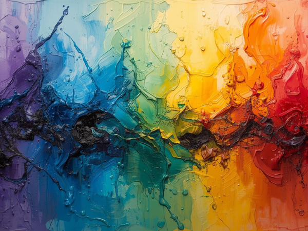
Color theory is the foundation of painting, guiding artists in how to mix, match, and balance hues to create visually compelling works. For young painters, understanding these principles can transform their art from simple experimentation into intentional expression. Below are nine essential tips, each explained in detail, to help beginners master color theory and apply it confidently in their creative journey.
Understanding the Color Wheel
The color wheel is the starting point for learning color theory. It organizes colors into a circular diagram, showing relationships between primary, secondary, and tertiary hues.
Key Points
- Primary Colors – Red, blue, and yellow; cannot be created by mixing other colors.
- Secondary Colors – Green, orange, and purple; formed by mixing primaries.
- Tertiary Colors – Combinations of primary and secondary colors, like red‑orange or blue‑green.
- Complementary Colors – Opposites on the wheel, such as red and green, which create strong contrast.
- Analogous Colors – Neighbors on the wheel, like blue and green, offering harmony.
By studying the color wheel, young painters gain a roadmap for mixing and balancing hues. It helps them avoid muddy tones and achieve vibrant results. Mastering this tool ensures that every painting begins with a solid understanding of how colors interact.
Warm vs. Cool Colors
Colors are often categorized as warm or cool, and this distinction influences mood and depth in a painting. Warm colors evoke energy, while cool colors suggest calmness.
Key Points
- Warm Colors – Red, orange, yellow; associated with heat, passion, and vibrancy.
- Cool Colors – Blue, green, purple; linked to tranquility, water, and distance.
- Emotional Impact – Warm tones energize, cool tones soothe.
- Depth Creation – Warm colors advance visually, cool colors recede.
- Balance – Combining both creates dynamic compositions.
Understanding warm and cool tones allows painters to control atmosphere and perspective. For example, a sunset scene benefits from warm hues, while a forest landscape thrives on cool greens. By blending both, artists can create balanced works that feel alive and multidimensional.
The Power of Complementary Colors
Complementary colors are pairs that sit opposite each other on the color wheel. They create striking contrasts and can make elements stand out dramatically.
Key Points
- Red & Green – Bold contrast, often used in festive themes.
- Blue & Orange – Vibrant pairing, popular in landscapes and portraits.
- Yellow & Purple – High contrast, adds drama to compositions.
- Neutral Balance – Mixing complements can tone down intensity.
- Highlighting – Complements draw attention to focal points.
Using complementary colors strategically helps young painters emphasize subjects and create visual excitement. However, overuse can overwhelm the viewer. The key is moderation—using complements to highlight important areas while balancing with neutrals or softer tones.
Analogous Color Harmony
Analogous colors are groups of three or more hues that sit side by side on the color wheel. They create harmony and unity in paintings.
Key Points
- Examples – Blue, blue‑green, and green.
- Smooth Transitions – Colors blend seamlessly without harsh contrast.
- Mood Creation – Analogous schemes often feel calm and natural.
- Flexibility – Works well in landscapes, abstract art, and portraits.
- Accent Use – Adding a complementary color can enhance interest.
Analogous color schemes are perfect for beginners because they reduce the risk of clashing tones. They allow painters to focus on composition and brushwork while maintaining pleasing harmony. This approach is especially effective in nature‑inspired art, where gradual shifts in color mimic real environments.
Value and Contrast
Value refers to the lightness or darkness of a color, and it plays a crucial role in defining form and depth.
Key Points
- High Value – Light colors, often used for highlights.
- Low Value – Dark colors, used for shadows.
- Contrast – Strong differences in value create drama.
- Depth Perception – Value shifts suggest three‑dimensional space.
- Balance – Moderate contrast ensures readability.
Young painters often focus on hue but overlook value. By practicing with grayscale studies, they can learn how light and dark define shapes. Applying this knowledge to color ensures that paintings feel dimensional and balanced, with clear focal points.
Saturation and Intensity
Saturation describes how pure or vivid a color appears. Intensity affects mood and visual impact.
Key Points
- High Saturation – Bold, vibrant colors that demand attention.
- Low Saturation – Muted, subtle tones that feel calm.
- Mixing Neutrals – Adding gray or complementary colors reduces saturation.
- Emotional Effect – Bright tones energize, muted tones relax.
- Balance – Combining both creates depth and variety.
Painters can use saturation to guide the viewer’s eye. For example, a highly saturated focal point surrounded by muted tones ensures emphasis. Learning to control intensity helps young artists avoid overwhelming compositions and instead create nuanced, layered works.
Color Temperature in Shadows and Highlights
Color temperature influences how shadows and highlights appear, adding realism and depth.
Key Points
- Warm Shadows – Often found in sunlight, with hints of red or orange.
- Cool Shadows – Common in artificial light, with blue or purple tones.
- Highlights – Can be warm or cool depending on the light source.
- Atmosphere – Temperature shifts affect mood and realism.
- Layering – Mixing warm and cool tones enhances dimension.
Recognizing temperature differences in light helps painters avoid flat shading. Instead of using black for shadows, adding cool tones creates depth. Warm highlights can make subjects glow naturally. This technique elevates paintings from beginner to professional quality.
Psychological Effects of Color
Colors influence emotions and perceptions, making them powerful tools for storytelling in art.
Key Points
- Red – Passion, energy, danger.
- Blue – Calm, trust, sadness.
- Green – Growth, nature, balance.
- Yellow – Happiness, optimism, caution.
- Purple – Luxury, mystery, creativity.
By understanding psychology, painters can intentionally evoke feelings. For example, using blues in a portrait can suggest serenity, while reds may convey intensity. Young artists should experiment with color symbolism to enhance narrative depth in their work.
Practical Tips for Mixing Colors
Mixing colors is both science and art. Beginners often struggle with muddy tones, but practice and technique can solve this.
Key Points
- Start with Primaries – Learn how red, blue, and yellow interact.
- Use a Palette Knife – Ensures clean mixing without contamination.
- Add Colors Gradually – Prevents overpowering blends.
- Experiment with Ratios – Small changes create big differences.
- Keep Notes – Document mixes for future reference.
Mastering mixing allows painters to expand their palette beyond store‑bought tubes. It builds confidence and creativity, enabling them to craft unique hues tailored to their vision. Over time, this skill becomes second nature, empowering artists to express themselves fully.