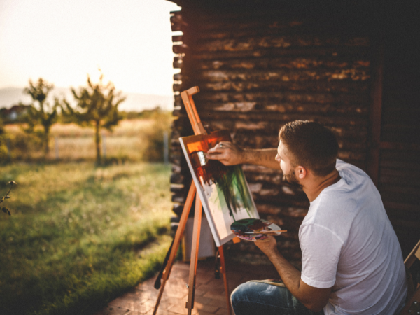
When your artwork is well composed, it draws viewers in and keeps their eyes exploring every detail. But how do you create that magnetic balance and flow? You’ll discover 7 essential rules that will transform your compositions from ordinary to unforgettable.
The Rule Of Thirds
The Rule of Thirds is a fundamental principle in art composition. It divides the canvas into a 3×3 grid. This simple technique guides artists to place key subjects at the intersections of the lines. Using the Rule of Thirds creates a more dynamic and engaging composition compared to centering the subject.
Creating An Off-center Balance
Placing the main elements off-center is key to the Rule of Thirds. Instead of putting the subject right in the middle, position it along the grid lines or at their intersections. This technique creates an off-center balance that feels natural and pleasing. It stops the artwork from looking static or boring.
Here are some tips for creating off-center balance using the Rule of Thirds:
- Divide the canvas into a 3×3 grid before starting your work.
- Place important elements at or near the four intersection points.
- Balance the main subject with secondary elements in opposite grid areas.
- Use empty space intentionally to enhance focus on your subject.
- Adjust the horizon or other lines to follow the top or bottom horizontal grid lines.
Below is a simple table showing how subjects can be placed using the Rule of Thirds:
| Grid Section | Example Placement | Effect on Composition |
|---|---|---|
| Top-left intersection | Subject’s eye or focus point | Draws viewer’s attention to upper left |
| Bottom-right intersection | Secondary object or balance | Creates harmony and guides the gaze |
| Center grid lines | Horizon or dividing lines | Offers natural separation and structure |
Applying the Rule of Thirds helps avoid boring center placements. It encourages thoughtful design and makes your art feel alive and well-composed.
Using Leading Lines
These lines guide the viewer through the artwork, making the experience more engaging. Leading lines can be anything from roads, fences, rivers, to arm gestures. They help create a sense of movement and depth, drawing attention to the key parts of the piece.
Guiding The Viewer’s Eye
Use lines to direct attention toward the main subject. This technique helps the viewer know exactly where to look first. Artists often use natural or created lines in their work to lead the eye across the scene. These lines can be straight or curved, thick or thin, but their goal is to guide without distracting.
Common examples of leading lines include:
- Roads that stretch into the distance, pulling the eye forward.
- Fences or railings that create clear pathways.
- Rivers flowing through a landscape, leading to a focal point.
- Arm gestures or body positions that point toward the subject.
These lines do more than point. They create a feeling of movement and depth. By following the lines, the viewer travels through the artwork as if moving inside it. This interaction adds interest and keeps attention longer.
| Type of Line | Effect | Example |
|---|---|---|
| Straight lines | Lead eye quickly to subject | Roads, fences |
| Curved lines | Guide gently, create flow | Rivers, waves |
| Diagonal lines | Add energy and movement | Arm gestures, slopes |
Using these lines thoughtfully makes your art feel alive. The viewer’s eye moves naturally, discovering parts of the work in order. This keeps focus on the main subject and supports the story you want to tell.

The Rule Of Odds
The Rule of Oddsplays a key role in creating compelling art compositions. This rule suggests you group objects in odd numbers (e.g., three or five). Arranging an odd number of subjects is more visually appealing to the eye. It creates a more natural and less static look compared to even numbers.
- Choose three or five objects instead of two or four.
- Place the main subject off-center for balance.
- Use odd numbers for focal points and supporting details.
- Experiment with different sizes and distances between objects.
Even numbers split attention evenly, making the scene feel balanced but dull. Odd numbers create a subtle imbalance, which keeps the viewer engaged. The mind tries to find a pattern, making the artwork feel dynamic and alive.
Creating A Focal Point
Creating a focal point is essential in art composition. It helps to guide the viewer’s eye and makes the artwork more engaging. A clear focal point gives your art purpose and direction.
Giving Your Art A Clear Subject
Designate a primary point of interest. This means choosing one main element in your artwork that stands out above all others. This focal point should be the center of attention. The viewer’s eye should go here first.
To give your art a clear subject, keep these tips in mind:
- Use contrast to highlight the focal point, such as light versus dark or color differences.
- Apply sharper details or stronger lines to the main subject.
- Arrange elements around the focal point to lead the eye naturally toward it.
- Limit distractions by reducing clutter or simplifying the background.
Here is a simple table showing how different techniques support the focal point:
| Technique | How It Supports the Focal Point |
|---|---|
| Contrast | Makes the subject stand out clearly against surrounding areas. |
| Detail | Draws attention by making the subject more interesting to look at. |
| Composition | Directs the viewer’s eye toward the main subject naturally. |
| Simplicity | Reduces distractions so the focal point remains dominant. |
Everything else should support the focal point. Avoid placing too many strong elements in one area. Keep the focus clear and simple. This clarity makes your art easier to understand and more powerful. The subject becomes memorable and meaningful.
Symmetrical & Asymmetrical Balance
Symmetrical balance means objects are evenly arranged on both sides of a center line. This creates a calm and stable feeling. Asymmetrical balance uses different elements balanced by their visual weight. It gives a more dynamic and interesting look but still feels balanced.
Creating Visual Harmony
Visual harmony happens when all parts of a painting or drawing look good together. Symmetrical balance creates harmony by placing objects evenly on each side. This makes the artwork feel peaceful and easy to understand. It is common in portraits, architecture, and designs that need order.
Asymmetrical balance achieves harmony differently. It uses different shapes, colors, or sizes but balances their visual weight. For example, a large dark shape on one side can balance a small light shape on the other.
Here are key points for both types of balance:
- Symmetrical: Objects are evenly arranged on both sides.
- Asymmetrical: Different elements are balanced by weight.
- Both provide a feeling of stability or tension.
- Symmetry feels calm; asymmetry feels dynamic.
Artists choose between these balances based on the story or feeling they want. Sometimes mixing both creates the best results. Careful use of balance leads to strong, clear, and beautiful compositions.
Framing Your Subject
Framing your subject plays a crucial role in creating compelling compositions in art. It guides the viewer’s eye directly to the main point of interest. A well-framed subject stands out and tells a stronger story.
Artists often use different methods to frame their subject. This can include natural elements, architectural features, or even creative use of light and shadow. Proper framing gives balance and focus, making the artwork clear and impactful.
Using The Environment To Your Advantage
Artists can use elements like a window or doorway to frame their subject naturally. These elements create a natural border around the subject. This type of framing adds context and a sense of depth to the artwork.
Here are some ways to use the environment effectively:
- Place the subject inside or near a doorway to create a clear frame.
- Use tree branches or leaves to surround the subject.
- Include architectural features like arches or columns as borders.
- Use shadows or light patterns to outline the subject.
Using the environment also helps tell a story. The surroundings give clues about the subject’s place or mood. For example, framing a person inside a window can suggest introspection or separation.
| Environmental Element | Effect on Composition | Example Use |
|---|---|---|
| Window | Creates a natural border and depth | Portrait inside a window frame |
| Doorway | Focuses attention, adds context | Subject standing in a doorway |
| Tree branches | Encloses subject, adds texture | Wildlife framed by leaves |
| Architectural features | Creates strong geometric frames | Arch framing a building facade |
Using the environment as a frame offers a natural and effective way to highlight the subject. It adds layers of meaning and visual interest without extra effort.
Establishing Depth
Establishing depth helps artists show distance and space clearly. This skill improves the overall impact of any artwork. Using different techniques, artists can guide the viewer’s eye through layers of the picture. Depth adds richness and interest, making art more engaging and believable.
Making Your Art Feel 3d
To make your art feel three-dimensional, start by using foreground, middle ground, and background. These layers organize the space and create depth. Objects in the foreground are larger and more detailed. This draws attention and sets the scene. The middle ground connects the foreground and background smoothly. The background usually has less detail and softer colors, pushing it further away.
Use these tips to enhance 3D effect:
- Size variation: Larger objects appear closer, smaller ones seem distant.
- Detail level: More detail in the foreground, less in the background.
- Color and contrast: Brighter and stronger contrasts in the front, faded colors behind.
- Overlap objects: Place some elements in front of others to show depth.
- Use perspective: Lines that meet at a point create distance.
These methods create a sense of space and distance. They make the viewer feel like they can reach into the painting. Without depth, art often looks flat and lifeless. Use these ideas to bring your art to life and add dimension.