Imagine boosting your own skills by learning the hidden tricks experts use every day. You’ll uncover the simple but powerful methods behind stunning illustrations. Keep reading, and you’ll soon see your artwork in a whole new light.
Creative Sketching Methods
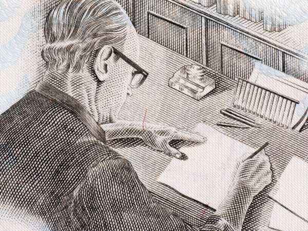
Creative sketching methods form the foundation of professional illustrations. These early drawing techniques help artists explore ideas and shapes freely. Sketching can be fast and loose or slow and detailed. Each style serves a purpose in turning rough concepts into polished artwork.
Loose Vs. Detailed Sketches
Loose sketches are quick, free-flowing drawings. They capture the general idea or composition without focusing on small details. Artists use loose sketches to brainstorm and experiment. These sketches often look rough and unfinished, but they are valuable for creativity and speed.
- Drawn with light, sweeping lines
- Focus on shapes and movement
- Allow mistakes and changes
- Encourage creative flow
Detailed sketches are more precise and refined. They include exact lines, textures, and shading. These sketches act as blueprints for the final artwork. Artists spend more time perfecting proportions and adding fine elements.
- Use darker, cleaner lines
- Focus on accuracy and detail
- Set clear guides for coloring
- Help communicate the final vision
| Aspect | Loose Sketches | Detailed Sketches |
|---|---|---|
| Purpose | Idea exploration | Finalizing design |
| Line quality | Light, rough | Dark, clean |
| Time spent | Short | Long |
| Detail level | Low | High |
Layering And Refinement
Layering and refinement improve sketches step by step. Artists build their drawings by adding layers over time. Each layer adds more detail and corrects mistakes from earlier stages. This method helps create clean and balanced illustrations.
Start with a simple base layer. This shows the main shapes and composition. Then add a second layer for outlines and shapes. Use a third layer to add textures, shadows, and highlights. Each layer refines the sketch further.
- Base Layer: Rough shapes and forms
- Outline Layer: Clear lines and edges
- Detail Layer: Textures and shading
- Final Touches: Clean up and polish
Digital artists use software layers for this process. Traditional artists use tracing paper or light boxes. This step-by-step layering reduces errors. It also helps keep the artwork organized and easy to edit.
| Layer | Purpose | Tools Used |
|---|---|---|
| Base | General shapes and layout | Pencil, light strokes |
| Outline | Define shapes and edges | Pen, darker pencil |
| Details | Add texture and shading | Fine liners, shading tools |
| Final | Cleanup and polish | Eraser, digital editing |
Color Theory In Illustration
Color theory is a key skill in professional illustration. It guides artists in selecting colors that work well together. This creates harmony and balance in the artwork. Using color theory, illustrators communicate ideas and emotions clearly.
Choosing Color Palettes
Choosing the right color palette is the first step in making a strong illustration. A good palette supports the story and style of the artwork. Artists pick colors based on the theme, message, and target audience. Simple palettes with a few colors often work best to avoid confusion.
- Monochromatic palettes use different shades of one color for a calm effect.
- Analogous palettes combine colors next to each other on the color wheel for harmony.
- Complementary palettes mix opposite colors to create contrast and energy.
Here is a quick guide to common palette types:
| Palette Type | Description | Effect |
|---|---|---|
| Monochromatic | Shades and tints of one color | Calm, unified look |
| Analogous | Colors next to each other on the wheel | Harmonious, soothing |
| Complementary | Colors opposite on the wheel | Vibrant, high contrast |
Artists also consider color temperature. Warm colors like red and orange feel energetic. Cool colors like blue and green are more relaxing. Combining these can guide the viewer’s focus effectively.
Mood Through Color
Colors strongly influence the mood of an illustration. Using the right colors sets the tone without words. For example, blue often feels calm and trustworthy. Red can signal passion or danger. Artists choose colors to match the feeling they want to create.
Here are some common moods and their related colors:
- Happy: Bright yellows and oranges
- Sad: Blues and grays
- Exciting: Reds and vibrant purples
- Peaceful: Soft greens and blues
Color saturation and brightness also affect mood. Bright, saturated colors feel lively and bold. Muted or pastel colors create a gentle, soft atmosphere.
Illustrators often use color shifts to show changes in mood. For example, a scene can start with warm colors and end in cool tones. This technique guides the viewer’s emotions through the story.
Mastering Composition
Mastering composition is a key skill in creating professional illustrations. It guides how elements are arranged on the canvas. Good composition makes an image clear and pleasing to the eye. It helps the viewer focus on important parts. Without strong composition, even detailed artwork can seem confusing or dull.
Rule Of Thirds
The Rule of Thirds divides an image into nine equal parts using two horizontal and two vertical lines. Important elements are placed along these lines or at their intersections. This method creates balance and interest naturally.
Here are some reasons why the Rule of Thirds works well:
- Creates Balance: Prevents the image from feeling too heavy on one side.
- Enhances Focus: Guides the viewer’s eyes to key areas.
- Improves Flow: Leads the viewer through the illustration smoothly.
Try using the Rule of Thirds grid to position:
- Main characters or objects
- Horizon lines in landscapes
- Points of action or interest
| Placement | Effect on Composition |
|---|---|
| Center | Strong, but can feel static or less dynamic |
| Rule of Thirds Intersection | Balanced and engaging composition |
| Edges or Corners | Creates tension or emphasis on surroundings |
Following this rule helps your illustrations feel more professional and well-crafted. It’s simple to apply and works for many styles and subjects.
Focal Points
A focal point is the area in an illustration that draws the viewer’s attention first. It is the most important part of the image. Setting a clear focal point makes your artwork easier to understand.
Ways to create a strong focal point include:
- Contrast: Use light and dark colors or bold shapes.
- Detail: Add more detail to the focal area than elsewhere.
- Color: Use bright or unique colors for emphasis.
- Size: Make the focal point larger than other elements.
- Placement: Position the focal point using the Rule of Thirds.
Here is a simple checklist to test your focal point:
- Is it easy to find immediately?
- Does it stand out from the background?
- Is it clear what the viewer should look at first?
- Does it guide the viewer’s eye through the rest of the illustration?
Without a clear focal point, an illustration can feel cluttered or confusing. The viewer may not know where to look. A strong focal point adds impact and story to your artwork. It helps communicate your message quickly and clearly.
Texture And Detail Techniques
Texture and detail techniques form the backbone of professional illustrations. These methods bring images to life by adding realism and interest. Artists use texture to make surfaces look rough, smooth, soft, or hard. Details help highlight important parts and guide the viewer’s eye through the artwork.
Creating Depth
Depth in illustrations makes objects appear three-dimensional. It helps viewers feel like they can step into the scene. Artists create depth through various techniques that manipulate light, shadow, and perspective. Here are key ways to build depth:
- Layering: Place objects in front or behind each other to show distance.
- Shading: Use light and dark tones to shape objects and suggest volume.
- Focus: Sharper details in the foreground, softer in the background.
- Color: Cooler, lighter colors push objects back; warmer, darker colors pull them forward.
Consider this simple table showing how artists adjust elements to create depth:
| Element | Foreground | Background |
|---|---|---|
| Detail | High | Low |
| Color Saturation | Bright and rich | Faded and muted |
| Contrast | Strong | Soft |
Creating depth takes practice but improves the viewer’s connection to the art. It changes flat pictures into scenes that feel alive.
Brushwork Styles
Brushwork adds personality and texture to illustrations. Different brush styles produce unique effects and moods. Professionals choose brushwork carefully to match the style and message of their art.
Common brushwork styles include:
- Dry brush: Creates rough, scratchy textures. Good for fur or wood.
- Wet brush: Smooth and flowing strokes that blend colors softly.
- Stippling: Small dots to build texture and shading.
- Hatching and cross-hatching: Lines used to show shadow and form.
Each style changes how texture and detail appear. Below is a brief summary of brushwork styles and their uses:
| Brush Style | Description | Common Use |
|---|---|---|
| Dry Brush | Scratchy, uneven strokes | Rough textures like bark or fabric |
| Wet Brush | Smooth, blended strokes | Soft skin tones, skies |
| Stippling | Dots to create shading | Gradual shadows, detailed texture |
| Hatching | Parallel lines | Shadows and form definition |
Choosing the right brushwork style enhances texture and adds detail. It helps illustrations feel natural and tactile, inviting viewers to explore every stroke.
Lighting And Shadow Effects
Lighting and shadow effects play a key role in making professional illustrations look real and alive. They add depth, mood, and focus to the artwork. Without proper use of light and shadow, illustrations can appear flat and dull.
Light Sources And Direction
Light sources define where the light comes from in an illustration. This affects how shadows fall and how bright or dark areas appear. There are a few common types of light sources:
- Natural light: Sunlight or moonlight, usually from one direction.
- Artificial light: Lamps, bulbs, or other man-made sources.
- Ambient light: Soft, scattered light that fills the scene.
Understanding the direction of light is essential. It determines the shape and length of shadows. Light hitting an object from the side creates long, dramatic shadows. Light from above produces short, sharp shadows. Front lighting flattens the image, reducing shadow visibility.
Here is a simple table to show how light direction affects shadows:
| Light Direction | Effect on Shadows | Visual Impact |
|---|---|---|
| Top | Short shadows below objects | Natural, soft look |
| Side | Long shadows to the opposite side | Dramatic, high contrast |
| Front | Minimal or no visible shadows | Flat, less depth |
| Back | Objects appear as silhouettes | Mysterious, strong outline |
Artists often combine multiple light sources to create complex effects. This technique helps highlight different parts of the illustration and adds realism.
Soft Vs. Hard Shadows
Shadows come in two main types: soft and hard. Each type changes the mood and feel of an illustration.
Hard shadows have clear, sharp edges. They occur when light hits an object directly from a small or focused source. Hard shadows add drama and strong contrast. They emphasize shapes and textures.
Soft shadows have blurred, gentle edges. They form when light scatters or comes from a large source. Soft shadows create a calm, natural look. They add subtle depth without strong contrast.
Here are key differences:
- Hard shadows: Clear edges, strong contrast, dramatic feel
- Soft shadows: Blurred edges, low contrast, gentle mood
Artists adjust shadow softness by changing the size and distance of the light source. Large, close light sources make shadows soft. Small, distant lights create hard shadows.


